Placemats that look great in a colourful kitchen or neutral scheme!
Looking for placemats that will look good in a colourful or a neutral kitchen? Here’s why my illustrated letter placemats rest easy in both settings:
Our illustrated placemats look fantastic with the glazed earth ware espresso cups I bought back from Provence this week. Why? Because they share the same colour palette as French illuminated manuscripts I fell in love with years ago. I talk about this on my ‘about me’ page.
Take a look at the photo I took of mats and cups laid out together. Vermillion is Mediterranean red. This is the red of Pompeii, just further East along the Med coast. I use to paint my lobster on the ‘Bon Appetit’ serving mat and elsewhere.
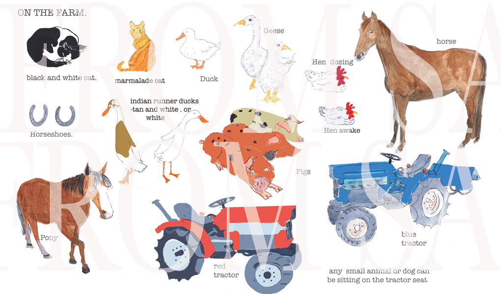
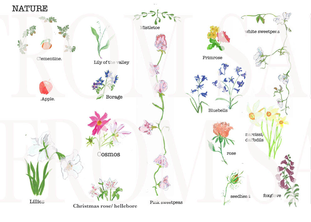
My Green espresso cup is an earthy terre verte, the same shade I used for the green of my mats. For example, the mistletoe on placemat letter M, or the acorn leaves in placemat A.
My choice of blue for all the letters was because the sky is blue and the sea is blue. We are surrounded by blue. My letters are the colour of the cerulean blue Mediterranean, set against a background of unbleached linen. The perfect foil to colour, like the rocks on which we sunbathed a week ago in les calanques de Cassis.
My last espresso cup is earthy yellow which reminds me of the chrome yellow Van Gogh so loved. In the summer of 1888 he writes to his brother Theo that he is painting sunflowers ‘with the same gusto as a marseillais eating bouillabaisse’.
I think a large bol of bouillabaisse would look great sitting on our mats! Splashes of deep orange are everywhere in my mats, Next time I’ll add to my collection and buy some burnt orange tasse d’espresso!